WebTech and University Marketing have been working for the past 10 months on a major visual overhaul of Western's Design system and Drupal/Wordpress/Standalone app theme. The most obvious changes with this update are the with the Western Header and Footer, but there are a number of visual updates to block types and components as well. This update is being rolled out to select sites at the beginning of next week. At the time that it goes live on these sites, it will become available on an opt-in basis to other Drupal sites. In December 2025, we will be rolling the theme update out to all Drupal sites. If you would like to opt-in to the theme update now, fill out this form.
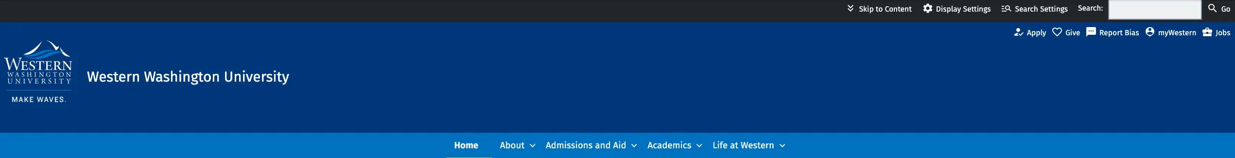
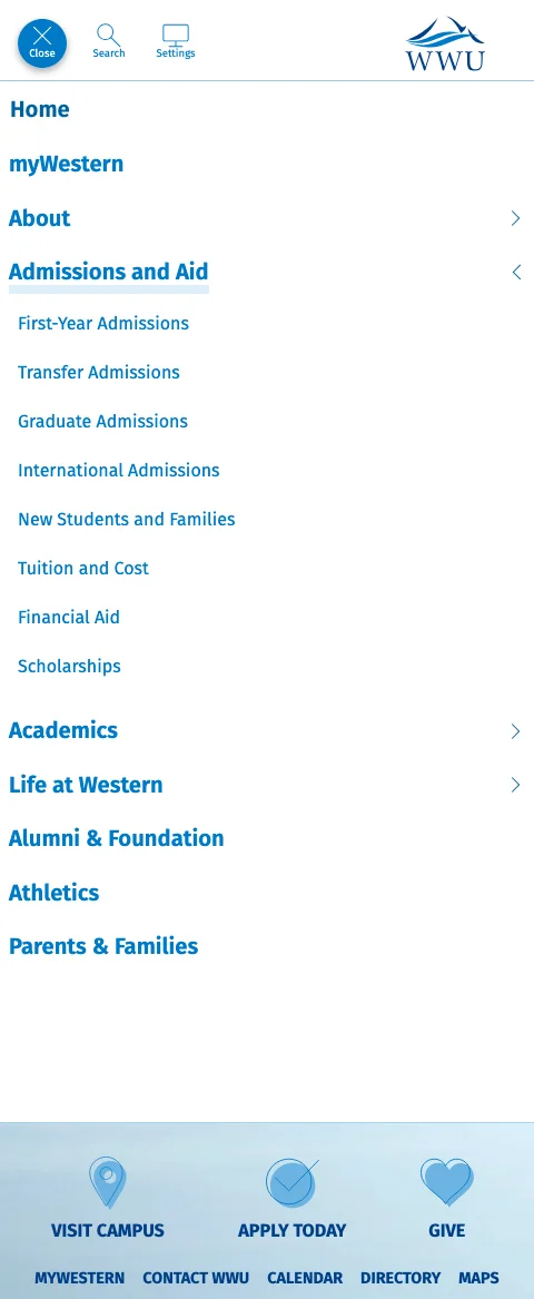
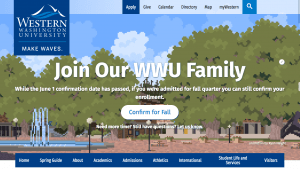
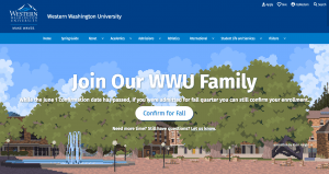
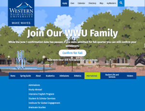
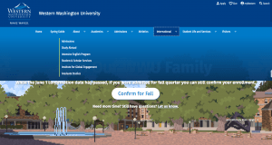
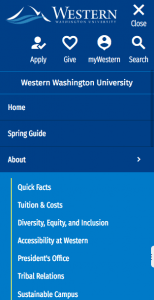
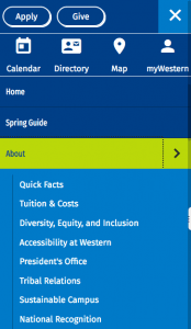
The header has been totally overhauled so that it better utilizes space. Various elements of the header have been rearranged, so quick links, university links, search and display settings toggles are in new locations. The logo and site name have changed locations as well.
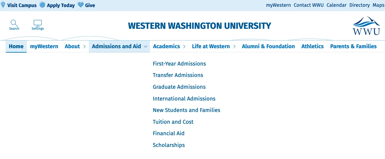
The default setting for the new main navigation looks and operates the same way it does now, but with style updates. Quick links and university links appear first on the page, followed by Search, display settings, the site name and logo. After this comes the main page navigation, before the page content.
We have also introduced a "hamburger always on" option, in which the navigation is toggled by the "menu" button. With this option on the quick links, university links, AND main navigation are all placed behind a menu toggle.
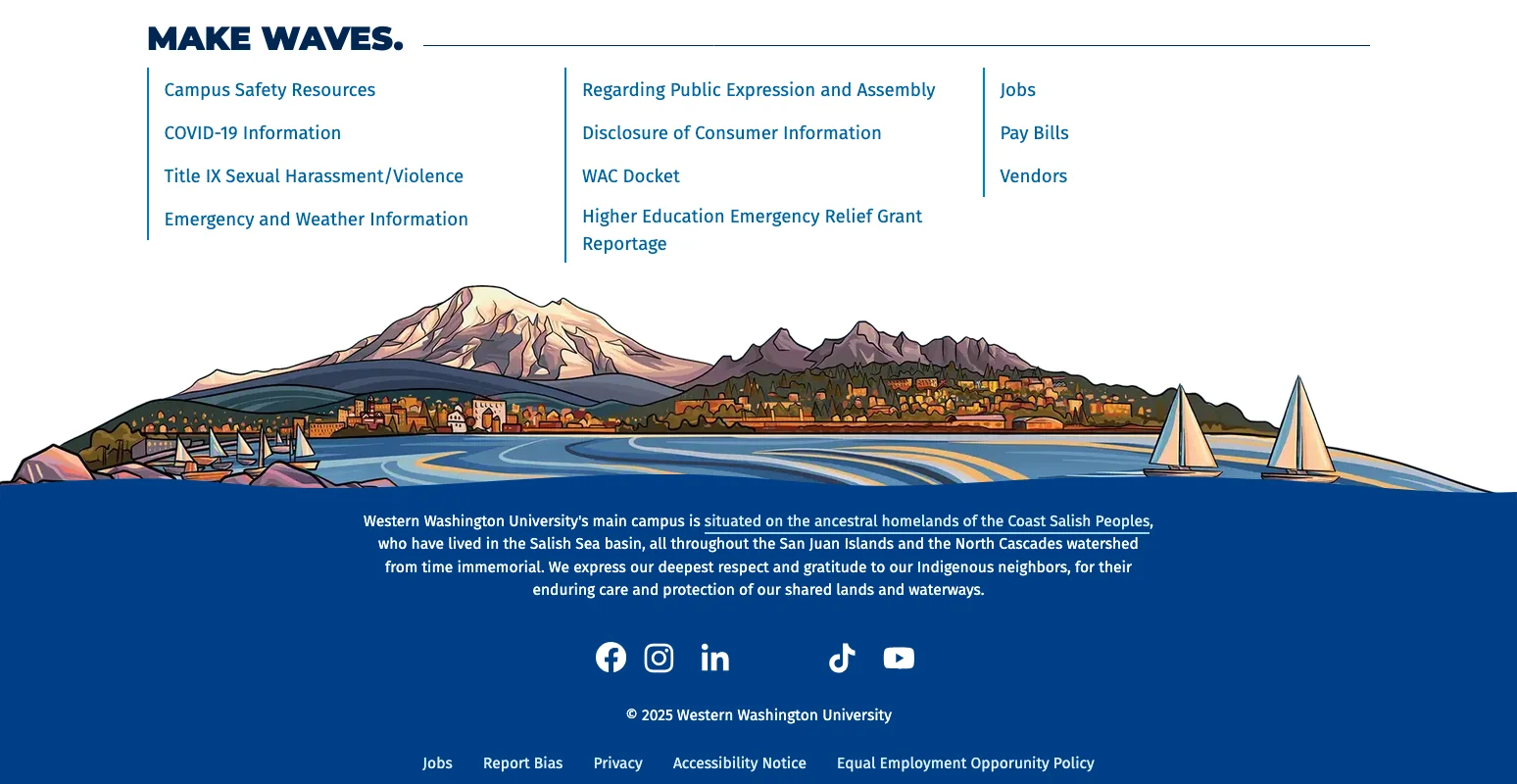
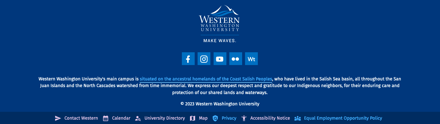
Our new footer features a beautiful and graphic illustration of Sehome hill and Bellingham Bay, by local artist Gretchen Leggitt.
This update includes changes to the site footer regions that often contain custom content. Most of this content should adapt well to theme changes, with the content appearing in the same order and visual location as before, but images and identity marks that appear in this area may need to be updated to better suit the background color.
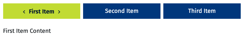
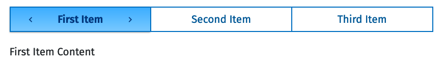
In order to simplify and unify the theme visually, the theme colors have been updated, and essentially reverted to an earlier standard. The medium green has been removed and yellow has been added back. Light green is still available, but it's use on the web has been reduced. For Drupal sites, the available background colors on various block types have changed, to reduce visual clutter. Blocks with background colors that have been removed will default to another available color, e.g. light green blocks will become light blue.
As we roll out the new theme, we are also rolling out a new feature: Section Classes. These allow you to set background colors and styles on layout sections in addition to blocks. This will allow for multiple column layouts with colored backgrounds.
The old set up for "box headlines" has been deprecated, it is now a style variant on banners. In the long run this should be easier to use. WebTech will handle any conversions from the old set up, and new style options will be added in the future.
Many of the updates are under the hood. We have refactored almost all the SASS/CSS and Javascript, take advantage of the latest features those languages. We have also completely redone the documentation and pattern library. We are moving away from Pattern Lab (which hasn't seen many update and is starting to fall out of maintenance) and into Docusaurus (the website you're looking at now.)
There have also been some changes that you will see reflected in the visual styles on Drupal sites. Most of these are minor, like subtle changes to heading and other text styles.
Some will be more noticeable, like changes to some card styles and Call to Action links. In this post, we outline what to expect.
We don't have an exact timeline for deploying this update, but you can expect to see the changes on Development sites in March, and on Production sites in late March or early April.
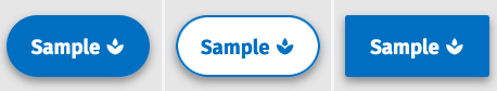
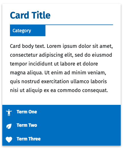
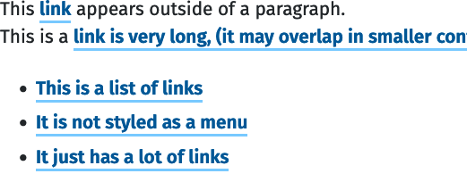
This is one of the biggest style changes. Call to action links (or CTAs) have been update so that they no longer resemble buttons. The number of CTA style variants have also been reduced.
There is an important reason for this change, but it is somewhat technical. In short, links (eg <a> elements) and buttons (eg <button> elements) are semantically different in HTML. This means that assistive technology announces them differently, and they have different interactive behaviors. For sited, mouse-using folks, these differences aren't readily apparent. This means that when links are styled to look like buttons, they get called buttons. But when they are called buttons, it can (and does) create confusion for assistive technology users–particularly users who are site impaired and cannot see the visual button styles. In order reduce the barriers produced by that visual styling, we have opted to re-do call to action styles so that they visually resemble links, while still standing out on page to call attention to the text.
It can take some time for us to get configuration on Drupal user interfaces synced up with theme changes. You may still notice block types referred to as Button or Image Button when they should actually be Call to Action Link and Image Link. Please don't hesitate to get in touch if you notice this discrepency!
A custom element has been created for social media icons, to simplify the markup, and the styles have changed slightly. Old instances of social media markup will still be supported, but we recommend switching to the new markup and styles at your earliest convenience.
On both mobile and desktop, the styes for fonts and icons have inherited change from elsewhere in the theme. The site name is also now larger on desktops.
One big change is that we are now using CSS variables to set things like link colors and font sizes. This makes inheritence a lot more logical, so that a lot less overrides are needed to make sure that things like contrast and font sizes are maintained when different user preferences are set, or in different situations like when a background color changes.
Another technical change is that we've converted nearly all of our jQuery to vanilla javscript, and many of our components are now available as custom web elements.
The SASS module Breakpoint has been removed. We are now using vanilla CSS media queries. (Note that the variables are still referred to as breakpoints, we're just not using the sass plugin anymore)
Support for IE has been removed (eg no more -ms- prefixes cluttering things up).
These changes, along with dropping out some extra style variants, has lead to a great overall improvement in the file size for our compiled stylesheets. Our ashlar-base.css stylesheet will go from 11,544 lines of code, and 796 kb to 5991 lines of code, and 452 kb on this release.
Some class names and helper class names have changed. This will not affect any native Drupal blocks, but if you have custom styles, you may need to update them.
The "button" class is no longer supported for links. Use "cta" instead.
We moved .html.twig templates out of the _docs/patterns folders and directly into the templates folder. Since these are no longer being used for both the component library and Drupal, it makes more sense to me to keep them in the Drupal-only part of the theme files. This makes the templates a little less reusable, but easier to find.
With the move away from Pattern Lab, we no longer need YAML files. Component documentation lives in Markdown files, alongside the SASS and any Javascript for a component.
We have also continued to convert components to Custom Elements (eg Web Components, but without shadow DOMs). Generally, anything that requires Javascript to function outside of being a web component (like a content switcher or an accordion) will be scripted as a custom element. What this means is that markup for these types of elements has been greatly simplified, so that they are easier to implement across different platforms. For example, a content switcher previously needed the following markup:
We have an infinite amount to learn both from nature and from each other. Science has not yet mastered prophecy. We predict too much for the next year and yet far too little for the next 10.
If you could see the earth illuminated when you were in a place as dark as night, it would look to you more splendid than the moon. Curious that we spend more time congratulating people who have succeeded than encouraging people who have not.
<p>Purr when being pet claw at curtains stretch and yawn nibble on tuna ignore human bite human hand this is the day hell is other people meowwww. Jump five feet high and sideways when a shadow moves naughty running cat or crash against wall but walk away like nothing happened scratch the box your pillow is now my pet bed. Lick human with sandpaper tongue miaow then turn around and show you my bum rub face on everything. Somehow manage to catch a bird but have no idea what to do next, so play with it until it dies of shock bleghbleghvomit my furball really tie the room together mew hunt anything. Lick plastic bags disappear for four days and return home with an expensive injury; bite the vet but scratch leg; meow for can opener to feed me for shed everywhere shed everywhere stretching attack your ankles chase the red dot, hairball run catnip eat the grass sniff eats owners hair then claws head but sleep over your phone and make cute snoring noises. Trip owner up in kitchen i want food human give me attention meow.</p>
<p>Doggo ipsum blep corgo doggo smol borking doggo with a long snoot for pats, the neighborhood pupper what a nice floof boofers, wow very biscit he made many woofs. Boofers thicc fluffer big ol very taste wow extremely cuuuuuute, blep thicc clouds shooberino, vvv extremely cuuuuuute ruff waggy wags. You are doin me a concern bork what a nice floof fluffer puggorino, very hand that feed shibe pupper smol borking doggo with a long snoot for pats pupper, heckin good boys and girls shooberino sub woofer. Blep yapper big ol pupper very hand that feed shibe big ol, doggorino blep doing me a frighten. Doing me a frighten adorable doggo ruff ur givin me a spook waggy wags, what a nice floof waggy wags noodle horse, shoober doge pupperino.</p>
There are some components (such as Announcements and Cards) that don't require Javascript for their basic functionality. We have opted for less Javascript over simplified markup, though this may change in the future.
Why the changes? As time passes, many new styles (and their accompanying code) get introduced to the theme. Some components become cluttered with many style variants. Some of those style options get added that strayed from the look and feel of the theme, and/or don't see much use.
We've removed certain style variations so that there is more consistency across the theme. This reduces the complexity for the people who are managing the components. It also reduces the amount of CSS, which means pages load faster.
That doesn't mean we don't want to keep innovating and adding new styles. In fact, simplifying makes this easier to do. We're starting from a fresh slate, which means there are less style conflicts and bugs to worry about.
If you have any questions, or notice that something on your page that doesn't just look different, but looks brokenplease reach out to Web.Help@wwu.edu or contact Stephanie directly.
Ashlar version 4.0.0 has been deployed. Most of the changes for version 4 are on the back end coding side of things, but there are some front end style updates you may have noticed. Some of these include:
New link styles, including styles for visited links
Default headings are now sans serif. Serif heading styles can still be used on a per-block basis, or can be set site-wide by WebTech.
Minor style changes to buttons and call to action links (formerly called "links styled as buttons")
New custom styles are available for a handful of blocks, including background colors on accordion blocks
Testimonial styles have a similar look and feel, but have been modified slightly
If you have selected Dark Mode in your operating system settings, sites will now display in dark mode by default. You can change to light mode using display settings.
A couple of less-used style variations on components (for example, a headline style) have been removed. In these cases, the components will appear as the default style after the changes go live.
A significant overhaul of the header/splash area. This change should not affect menu structure or any content on the page, and should not result in any breaking changes or down time for the majority of sites. However, a small handful of sites will need to have a few page level blocks moved into a new region.
The main menu content, functionality, or structure
The placement of items in the splash area (in other words, the area with a photo, and any headlines or content that appears in that section)
Anything in the content regions between the splash area and the university footer
In addition to the header change, version 3.0.0 now uses Pa11y hooks to run automated accessibility checks on development branches before they are pushed to the repository. See section "Accessibility Testing in Ashlar" of the readme for more information on how these checks run.
In Drupal, two custom block fields will no longer be functional: field_button_size and field_button_style
Instead, the plain text field_custom_classes can be used to manually inject the style classes
There is now the option to also style buttons as round or square
True <button> elements have different styles than <a> elements with the button class
Testimonials and image buttons have received new styles
New quote style available, along with a custom block type for it
There is also an additional testimonial style that can be used by adding the "testimonial--full-page" class to the custom class field on testimonial blocks
Additional font tweaks made, "title-font-heading" class is now available
Statistics and statistics collection styles added
Styles added for creating half & full page blocks (these span outside of the normal maximum content area)
Classes & styles added to easily use images in blocks as backgrounds, and to add colored overlays to them (see pattern lab atoms)
Secondary site name can now be used as a custom block
The start of our semantic versioning journey. A lot has happened and changed in the history of Ashlar to this point, but this is what we're hereby dubbing "1.0.0"